
Background
As part of the quarterly Peformance in Initiating and Delivering Clinical Research (
The CTP team have built a QlikView dashboard that allows access to this appendix data for all current submissions, as well as historical data where appropriate. The idea is to allow easy access to all data in one central place, through a widely used software capable of storing large amounts of data, as well as allowing interrogation of this data through a more interactive interface.
Acronyms
|
Acronym |
Definition |
|---|---|
|
CTP |
Clinical Trial Performance |
|
PI |
Performance in Initiating |
|
PD |
Performance in Delivering |
IT requirements
- Internet browsers – Google Chrome 7 and above, Mozilla Firefox, Internet Explorer 7 and above. Google Chrome is the ideal browser to use in order to access the dashboard.
Any computer operating system can be used to access the dashboard, as it is viewed through an Internet browser.
Accessing the dashboard
1. The CTP dashboard can be found online at: https://qlikview.gmg-is.co.uk/qlikview/index.htm
2. The CTP team have created an account for all NHS trusts to access the dashboard, the details of which have been shared with everyone. Login details should be noted down. If you don’t remember the login, please contact the CTP team at ctp@nihr.ac.uk.
3. All NHS trusts will be able to browse the dashboard and access the appendix data independently of one another.
4. Once you’ve followed the link above, please enter the login details provided into the sign in page.
5. The QlikView homepage screen will then be displayed.
6. Click on ‘CTP Dashboard.qvw’ to enter the application.
Navigating the dashboard - Performance in Initiating appendix
7. When you open the dashboard, the home screen will be displayed. Click the ‘Get Started’ button or the ‘PI Appendix’ tab displayed in the ribbon along the top of the dashboard.
![]()
![]()
8. This will take you to the appendix page for Performance in Initiating data which displays the latest quarterly submission.
9. The first sub-tab, ‘Analysis’, displays the appendix table of all trusts split by league and sorted from highest to smallest based on the total number of trials submitted.
10. Use the league filter on the left hand side to filter to a specific league. Click on the arrow, and then again on the specific league to apply the filter.
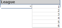
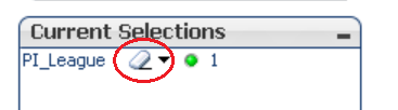
11. To clear the filter, you can use the ‘Clear Selections’ icon or the rubber next to the league dimension in the current selections box.
![]()
12. Totals for each column can be located at the bottom of the table. When you apply the filter to display a specific league, these totals will adjust in accordance with what league has been selected.
13. If you wish to apply your own filters. For example, to filter on the NHS trust column or any of the totals, rankings or duration analyses, please right click on the table and click ‘Send to Excel’. The table will then download as an Excel file. You can then apply filters across each of the columns.
14. To view the stock charts, click on the ‘Graphs’ sub-tab.
![]()
15. By default, the stock chart for all leagues is displayed. Similarly to the ‘Analysis’ tab, you can use the league filter on the left hand side to filter to a specific league.
16. To clear the filter, use the ‘Clear Selections’ icon or rubber next to the league dimension as mentioned before.
17. The ‘Data Quality’ sub-tab provides a summary of data quality issues found for each trust in that submission period. To use filters, you will have to right click on the table and ‘Send to Excel’ to apply your own filters across the dataset.
18. The ‘Reasons for Delay’ sub-tab displays a pie chart and summary table of the total number of times each reason for delay was selected as well as a proportional representation of these totals from the data submitted.
Navigating the dashboard - Performance in Delivering appendix
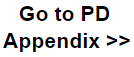
19. To access the latest data for Performance in Delivering, you can click the ‘PD Appendix’ tab along the top or the ‘Go to PD Appendix’ link on the ‘PI Appendix’ tab.
![]()
20. The PD appendix is set out similarly to the PI appendix. The ‘Analysis’ sub-tab can be filtered the same way as the PI data (see previous section bullet point 4).
21. Specifically for the PD data, the graph sub-tabs have been split into % trials meeting the target out of those with a target and % trials meeting the target out of all trials. These can be located under the sub-tabs called ‘Graphs TMT’ and ‘Graphs TMT (All Trials)’ respectively.
22. Like the stock charts for the PI data, the league filter can be used to filter the bar charts to a specific league. All bar charts are sorted from the highest percentage to lowest percentage.
23. The final sub-tab, ‘Reasons for Closure’, contains a pie chart and table summary of the total number of times each trial closure reason was selected as well as a proportional representation of these totals from the dataset.
Navigating the dashboard - PI & PD Analysis tabs
The CTP dashboard has also been set up to display all historical data/analyses from previous submissions as well as the latest submission in the appendix. All historical data as well as the latest data can be found under the ‘PI Analysis’ & ‘PD Analysis’ tabs.
The analysis tabs are set out in exactly the same format as the appendix tabs, but an additional filter has been included where you can select what submission period you want to filter to. All PI data goes back to Q1 18-19 (when the benchmark was removed) and for PD, the data goes back to Q4 15-16.
- To access the data, click on either the ‘PI Analysis’ or ‘PD Analysis’ tabs.
- The analysis tabs are set up so that once you select a quarter from the filter on the left hand side, the data is displayed.
- Once data is displayed, you can use the league filters as described previously to filter as appropriate.
- Please see instructions from the section ‘Navigating the dashboard (Performance in Initiating appendix’ for more information on clearing filters and exporting the analysis table to Excel.
- Each subsequent sub-tab on both analysis tabs has a quarter filter to allow the data to be displayed.
- You can also select multiple quarters by holding down the mouse and dragging the cursor over them. Please note that this will aggregate the data and totals for all selected quarters together.
- To switch between the PI and PD analysis tabs, you can click on the tabs themselves in the ribbon along the top, or you can use the ‘Go to PI/PD Analysis’ link displayed on the left of both tabs.
Please contact the CTP team if you have any questions about the dashboard and if you feel any additions can be made to improve the functionality.